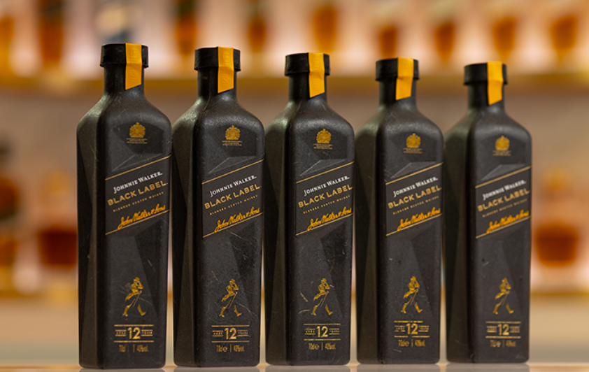
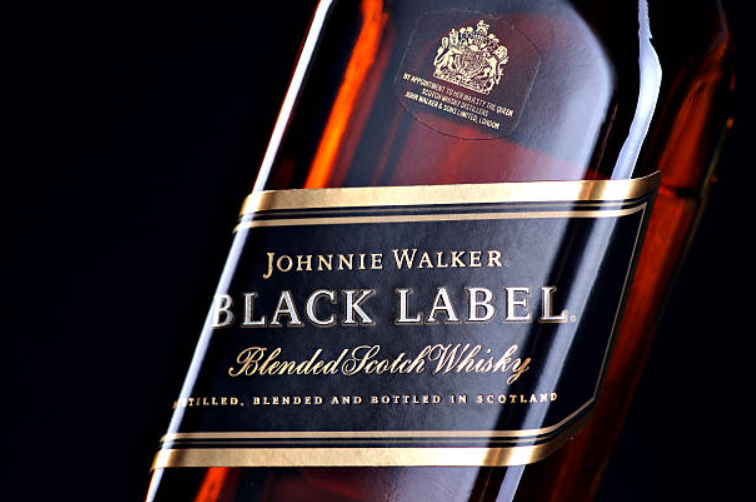
Johnnie Walker Black Label undoubtedly one of the most recognisable bottles on the shelf, distinguished by its sleek design, slanted label, bold gold typeface, and that unmistakable name: Black Label. But have you ever stopped to ponder why it’s called that? Why not go with something like “12-Year-Old Deluxe” or perhaps “Walker’s Finest”?
The answer, as it turns out, is rooted not only in colour but also in clever marketing strategies, practical branding techniques, and a fascinating bit of whisky history that stretches back over a century. Before the diverse rainbow of Johnnie Walker labels that we are familiar with today, there existed just two simple colours: Red and Black. These two hues dramatically changed the way the world thought about and perceived scotch whisky.
A Colourful Rebrand For Johnnie Walker
By the turn of the 20th century, Johnnie Walker had already established itself as a significant player in the whisky market and was actively exporting its well-crafted whisky far beyond the borders of Scotland. However, its flagship blends were known by rather formal names, such as “Old Highland” and “Extra Special Old Highland.”
Despite being sophisticated titles, these names didn’t provide much explanation or remain particularly memorable, especially to an international audience eager for something more relatable. Interestingly, in the midst of this situation, drinkers began referring to the bottles simply by the colour of their labels instead, which turned out to be an informal yet effective approach. It was intuitive and, crucially, it worked wonders for the brand.
In 1909, the Walker family made a remarkably astute decision to embrace this natural trend. They chose to rebrand their two main expressions, now known as Johnnie Walker Red Label and Johnnie Walker Black Label, effectively transforming a common customer habit into a brilliant branding triumph.
The incorporation of colour gave the whiskies instant and universal recognition that transcended various languages and cultures. Johnnie Walker Black Label and Red Labels became not just eye-catching but also evolved into shorthand for style, strength, and identity in the whisky market.
What “Black” Really Meant
The choice to label one of their expressions as Johnnie Walker Black Label was about much more than merely the aesthetics of packaging. In contrast to the lighter, more accessible Red Label, which was specifically designed to be mixed and was built around a younger, punchier style that appealed to a diverse audience, the Johnnie Walker Black Label was intended to offer something that was decidedly more refined in nature.
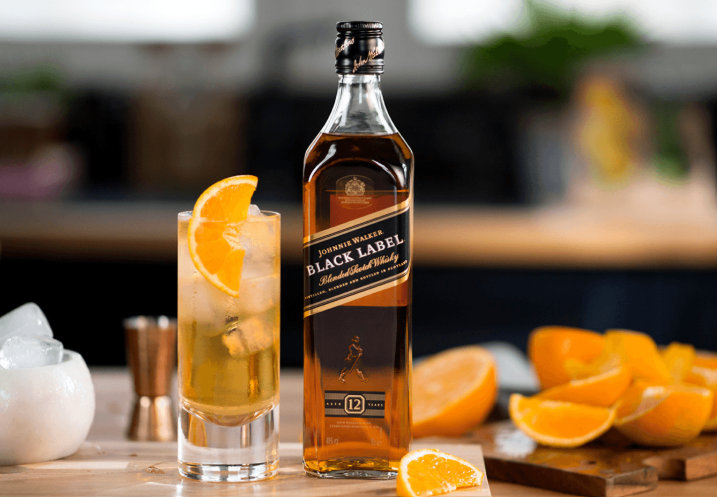
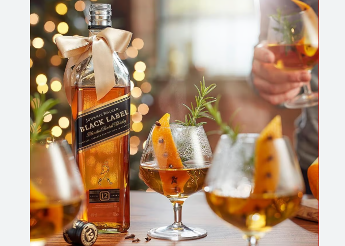
As a 12-year-old blend, it possessed a deeper and fuller character, making it altogether more suited for slow sipping rather than being mixed with soda water. This distinction not only highlighted the quality of the Johnnie Walker Black Label Black Label but also aligned with the evolving tastes of whisky connoisseurs looking for a more sophisticated drinking experience.
The Erstwhile Legacy
Prior to its colour rebranding, the product was known by the rather unwieldy and cumbersome name “Extra Special Old Highland.” This lengthy title often made it difficult for consumers to grasp its essence quickly. The shift to Johnnie Walker Black, however, brought about a newfound clarity and confidence in the brand’s presentation. This new name suggested attributes of seriousness and complexity, indicating a product that was not only refined but also multi-dimensional.
In making this change, it established a significant precedent in the industry: the idea that the use of colour alone could effectively convey important aspects such as character, age, and even the appropriate occasion for which the whisky was intended. This pivotal rebranding effort showcased the power of simplicity and visual representation in marketing.
Jonnie Walker And The Birth of a System
Johnnie Walker Black Label & Red labels weren’t merely successful in the marketplace; they laid the foundation for an entirely new way of thinking about whisky that would resonate for generations. The revolutionary idea that color alone could signify distinct character caught on quickly and began to evolve.
In time, other shades made their appearances: Green, Gold, and Blue, each one signaling a step up in age, flavor profile, or rarity among the options available. Even the more recent additions, like Double Black and Platinum, built upon the original 1909 logic that had set this colorful classification system into motion.
However, not every experiment that sought to expand this burgeoning system endured. A short-lived White Label had indeed been introduced to consumers but was quietly dropped soon after—it was, in part, due to a legal clash with Dewar’s similarly named expression, which put a halt to its potential success.
Nevertheless, the framework was already firmly established in the market. With the introduction of Johnnie Walker Black Label and Red Label, Johnnie Walker created more than just a pair of whiskies; they established an innovative visual language that still communicates distinctly and clearly to this day. The legacy of these color-coded selections continues to influence whisky drinkers and producers alike.
Why It’s Black
So why is Johnnie Walker Black Label… black? The answer lies in a fascinating mix of pragmatism, perception, and a touch of brilliance that sets it apart in the crowded world of blended whiskies. It was never simply about colour for colour’s sake; it was instead about actively giving shape to a blend that truly deserves and commands distinction.
Conclusion
The choice of black, in particular, serves a greater purpose and adds layers of meaning. Just the visual effect of this deep, rich colour becomes a powerful signifier of depth, maturity, and balance, all of which contribute to its exceptional character—all of this accomplished without saying a single word. The strategic decision to adopt this particular hue for Johnnie Walker Black Label speaks volumes about the quality and craftsmanship that goes into each bottle, enhancing its allure and prestige in an understated yet impactful manner.